Digging through some old files I found this little number - A Helloween CD jacket I designed during my school days. I love Halloween AND the band Helloween so this seems fitting for this month's post. Designing this CD cover was a fun and challenging project predominately with the photography, which was done by myself. I remember scavenging the dollar store in search of dusty, dirty old mirrors that, not only would suit it's dark theme, but also that I could smash and not feel guilty over. After destroying many mirrors and luckily not cutting myself, I transitioned through the design stage with ease. Being able to do your own photography has to be a designer's fantasy. When it comes to image use its not often we get just what we want or hoped from a client or can have such freedom of expression. This makes me want to work on my photography skills. Perhaps in a future post I'll showcase some more of my photography within my designs. In the meantime... Long live heavy metal!
TO HAVE A LOOK AT MY FULL GRAPHIC DESIGN PORTFOLIO, PLEASE CLICK HERE
2.10.08
22.9.08
Nobody Likes a Complainer!
The title certainly speaks for itself. I have designed and animated this web banner in Flash, not only for fun, but to practice some simple 2d animation and actionscript basics. Go ahead and try it out. Slap a bunny and give him something to really complain about!
To view in a larger window click > HERE
9.9.08
Geisha
Just doodling today the image of a geisha began to form. In no time I found myself playing with big bold shapes and interesting patterns. With little reference I kind of just went with my instincts on how she should look. This was the final result.
TO HAVE A LOOK AT MY FULL GRAPHIC DESIGN/ILLUSTRATION PORTFOLIO, PLEASE CLICK HERE
4.9.08
Such a Proud Father...
Here’s a short animation lip sync I’ve recently done. I tried to keep it simple and the acting convincing. Done in 3ds max. Rig by Manuel Sierra.
Such a Proud Father from Deanna Bishop on Vimeo.
26.8.08
Children's Books
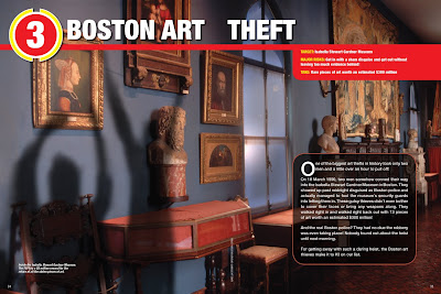
The next few images are a small collection of some work I did while at Rubicon Publishing where we designed and created educational children's books. This series is called "The Ten". All cover designs, illustration, layout, typography and photo selection were done by me. I also helped created the template in it's beginnings. The books were very much like a magazine where we had a simple set template that we had to be consistent with. It was a very creative and rewarding job with a great team of designers.
Portraits & Sketches
Here are a few portraits and sketches I created a few years back. The first one is a family portrait completed in approx 6 weeks. Medium is water based oils.
The the next few of paintings were commissioned together with my father, Robert Bishop, who is also a professional artist. He would give me the job specs of each piece and any special requirements. With that information I would then create the painting's composition. Nearing the final stages of painting my father would usually guide me in any finishing touches rarely needing to provide more than a handful of brush strokes. These were done with acrylic paint. I own the foundation of everything I know to my daddy dearest. I began taking lessons from him alongside a weekly art class he would host in his shop/studio at the age of 8.
The next is a portrait I did for a friend as a gift. Medium is acrylic.
And the next few are just quick life drawings done in either charchol, or marker.
20min sketch
30min sketch
5min sketch
19.7.08
Karate Kick!
Here's just a quick kick exercise I found myself getting into. Created in 3ds Max. Rig by Peter Starostin: http://www.3dluvr.com/clisk3d/
Karate Kick! from Deanna Bishop on Vimeo.
28.4.08
Wedding Invitations
So there's just under a couple months till my June 21st wedding back in Toronto. Last month I was busy designing my wedding invitations. It was a big job, but a lot of fun and a great exercise in using my graphic design skills. As a short note, my wedding theme is 1920's/art deco inspired and a big part of the theme is in the use of feathers. In other words, the theme will consistently be carried through by the use of peacock and ostrich feathers. Adding a theme to such a big event gives way for tons of creativity and fun things to work with. My florist is especially going nuts over the idea and has even postponed her holidays to tackle my fun and creative themed day. I've started things off by including the feather and an illustration/graphic of a peacock in my invitations.
A big part of the design process was in the paper selection. One can find this same paper and many many other options at www.envelopments.com . I love their "pocket fold" line, which is what I used as a starting point. I've chosen these paper designs because they are bold and somewhat reminiscent of the era, but at the same time they are modern and fashionable patterns.
The first image here is a small thumbnail of a peacock illustration I quickly drew up that seemed to stick. As messy as it was, I proceeded to trace it out and clean it up in Adobe Illustrator. The results were bold and expressive. I kept the same illustration throughout each piece of the package and only cropped where needed to highlight a certain part of the bird/feathers.
20.3.08
Hungry for Gnomes Remastered
Planning my fast approaching wedding and travelling around the last few months has left me with little time for creating new artwork. However, to avoid putting it off any further, I have recently re-composited some scenes from my student film. Here is the result.
Hungry for Gnomes from Deanna Bishop on Vimeo.
Subscribe to:
Posts (Atom)